
Mar 18, 2023
Problem
Finance teams and their supporting casts were highlighting a gap in their existing workflows that failed to surface financial performance of energy assets in real-time to enable them to drive business strategy and outcomes.
Outcome
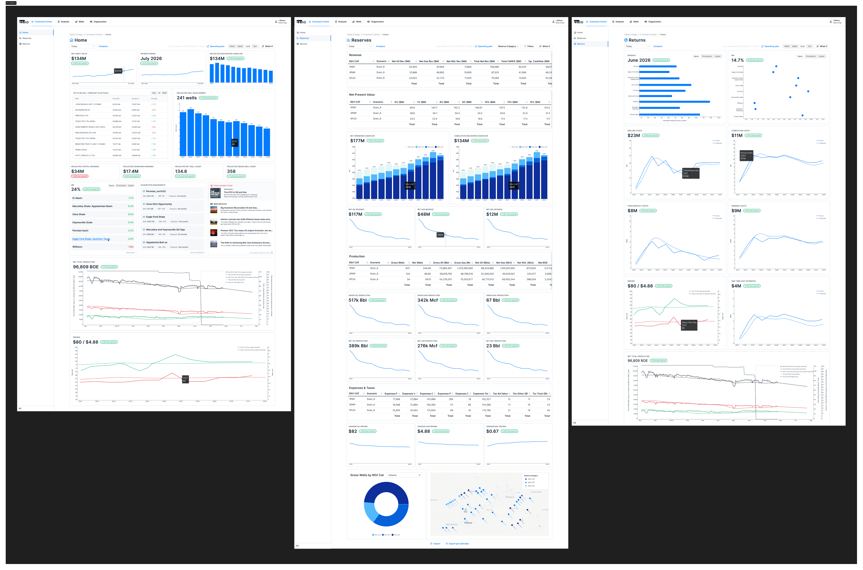
E&P Operators have comprehensive financial insights into over $1B in oil and gas assets with time to insights reduced under 10s per asset (previously averaged 3+ min. per asset). And Ad hoc sensitivity analysis now happens synchronously, reducing headcount and overhead costs.
Role
Principal Product Designer
Overview
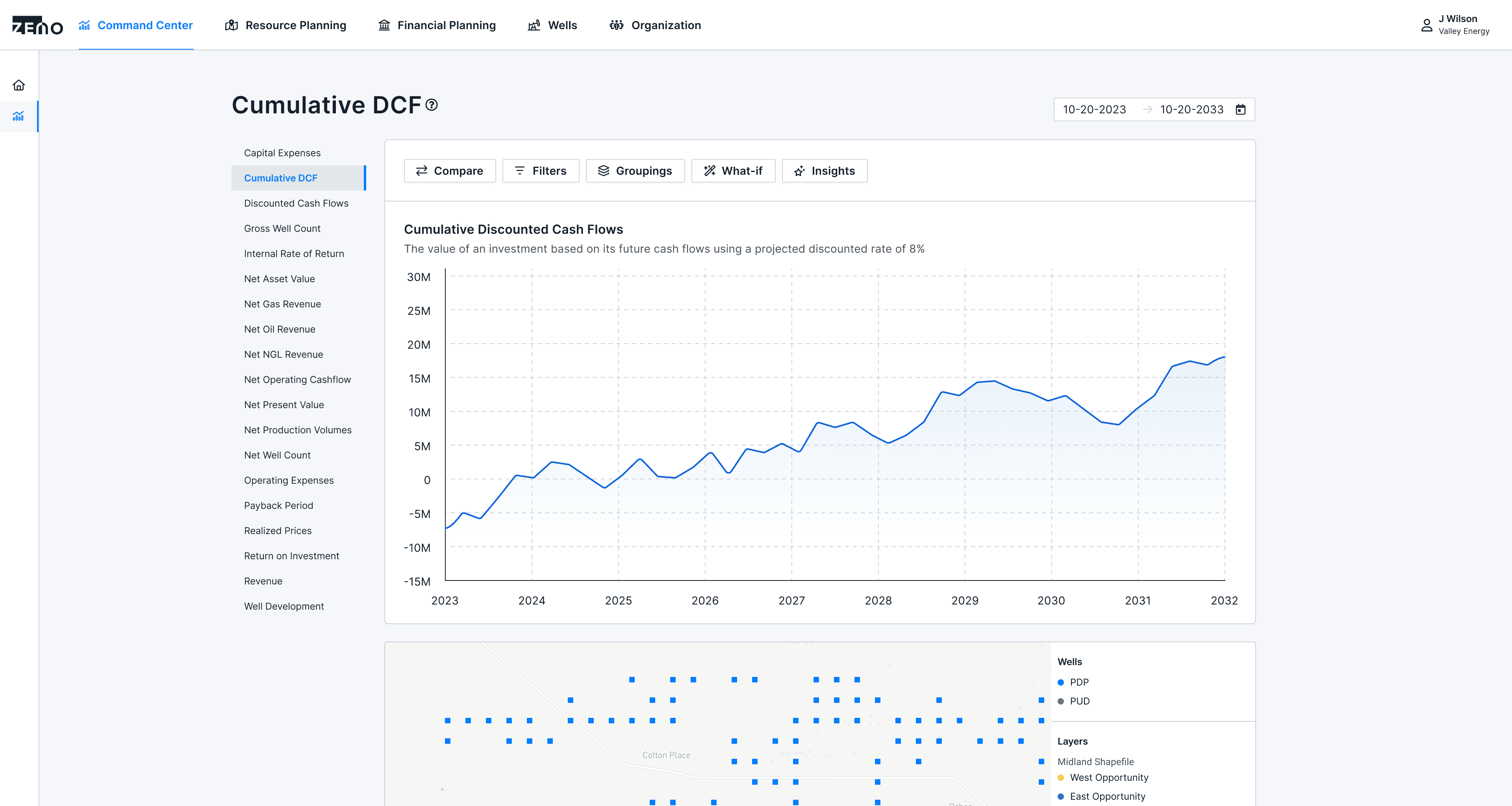
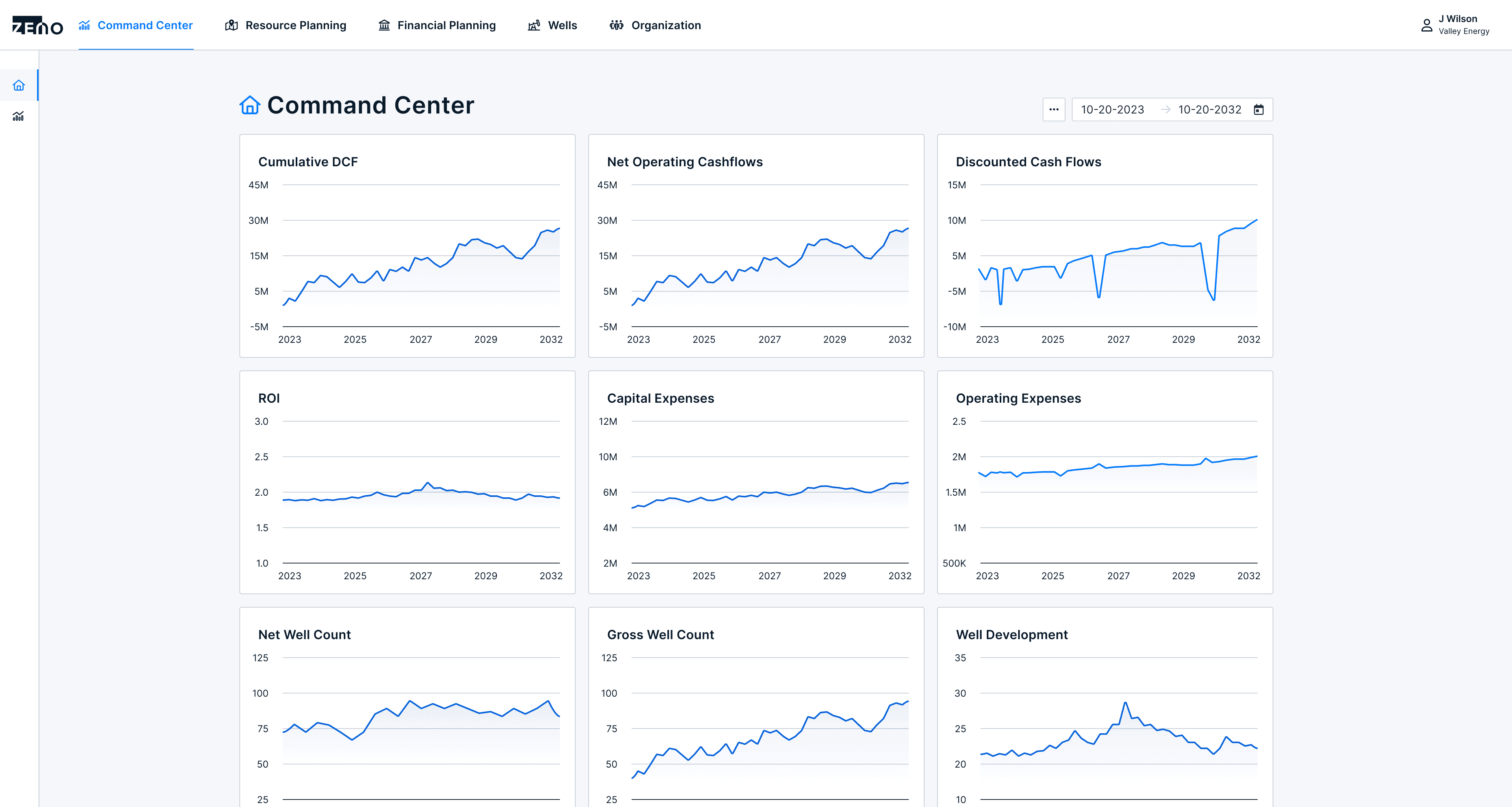
The Command Center embarked on a mission to revolutionize the oil and gas industry, aiming to empower operators with real-time performance data and bridge the gap between actual and projected cash flow forecasting. Our goal was to create a product that not only provided valuable insights but also enabled operators to make informed decisions and enhance overall business performance. We aimed to transform finance teams from service centers into esteemed business leaders, offering them the opportunity to provide invaluable support and insights to operations teams. By addressing the challenges faced by operators with accurate and timely information, our commitment was to help them optimize their assets and achieve their business goals.
Roles and Responsibilities
As Head of Product & Design for the product launch, my role was multifaceted. I led the Product Design team to create designs and user experience for the core of the Command Center product, while also collaborating with the CTO to shape the product roadmap, ensuring alignment with the overall vision. Working with a team of seven engineers, I facilitated scoping exercises, constraint discussions, and coordinated efforts for the product implementation. I reported directly to the CEO, providing regular status updates, and also fostered alignment with Sales, Marketing, and Customer Success teams. This collaborative approach allowed us to effectively communicate across functions and ensure a cohesive product launch.
Process and What Happened
The Beginning - What we were trying to do and why?
In the early stages of developing the Command Center, our focus was on engaging in conversations with customers to understand how existing software solutions addressed the visualization of financial performance data. We delved into the market to identify the tools available and evaluate their effectiveness in solving the problem at hand. We sought to uncover the pain points that teams were still struggling with, despite the existing solutions. Simultaneously, we aimed to recognize the strengths and successes of those tools. Our primary goal was to gain deep insights into our users' needs and the landscape in which we would be operating.
Challenges they faced
Firstly, we discovered that no one had successfully solved the challenge of providing real-time insights into financial performance. Teams would have to run scenarios that took hours to complete and followed by data table and powerpoint presentations to communicate those outputs.
Secondly, dealing with large data sets proved to be a common obstacle in efficient financial analysis. Existing tools often fell short when it came to incorporating all the necessary inputs to produce a comprehensive financial picture of asset performance.
Next, the process of aggregating and authenticating data records for up-to-date information posed a challenge for finance teams. Different teams, databases, and tools created significant roadblocks, hindering finance professionals from accurately and easily forecasting cash flow models for their business.
Lastly, we realized that teams and businesses lacked a standardized approach to analyzing financial performance for energy assets.
Based on our research, we began to formulate a working thesis: "By equipping finance teams with real-time performance insights into their energy assets, we can empower them to drive business decisions and shape effective strategies."
Users and Audience
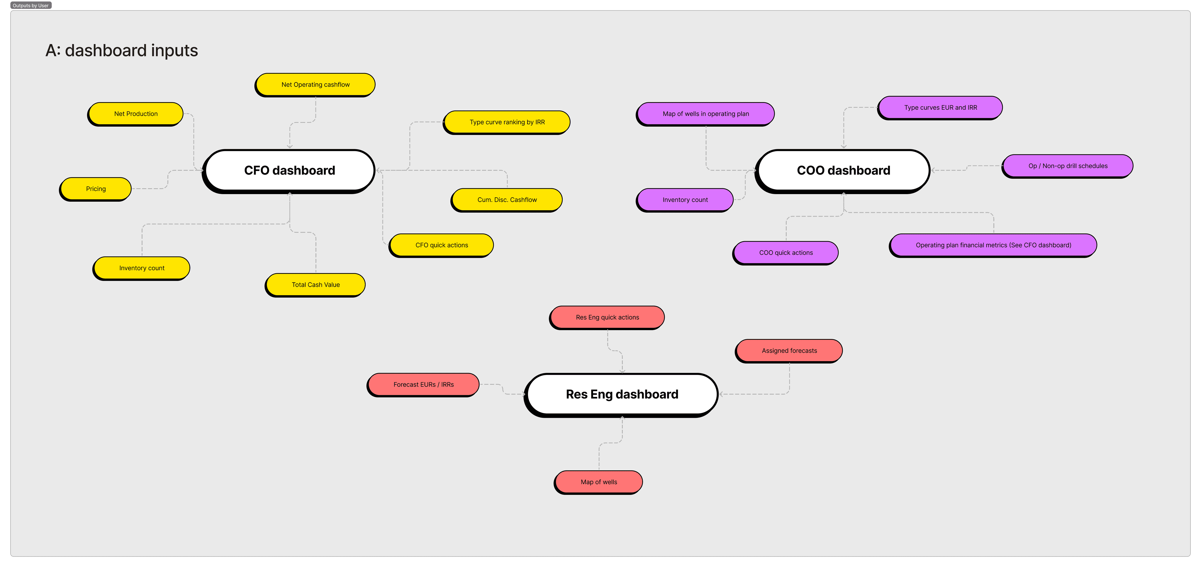
At the beginning of product discovery, the primary users and audience of the product were Finance teams in small and mid-cap Exploration and Production (E&P) operators. However, as the process continued, it became clear that the relevance of financial performance metrics extended beyond just Finance teams. We identified specific user groups such as Business Development and Operations that faced challenges in obtaining real-time visibility into the actual performance of energy assets compared to projections. To address these needs, our product was designed to empower various internal stakeholders across multiple departments with the access to accurate and timely performance data. By doing so, we aimed to provide a comprehensive solution that enabled them to make informed decisions and drive improved business outcomes.
Exploration and Ideation
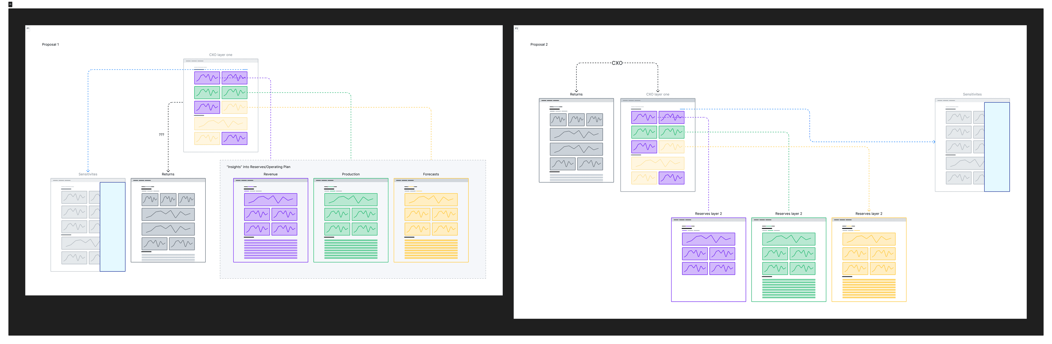
As we ventured further into the exploration phase, we encountered a tendency among stakeholders and customers to immediately assume that the new experience required a fully customizable analytics dashboard. However, it posed a challenge to determine the underlying reasons behind this request. Did it align with the desired behavior? Was it influenced by existing mental models from other financial tools and software? Where did the true value lie?
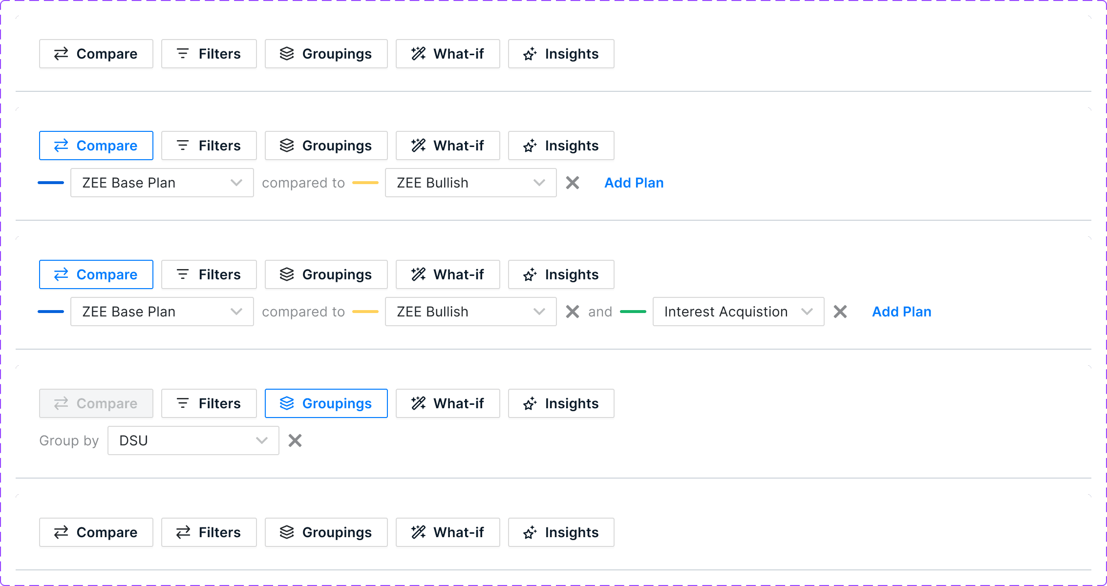
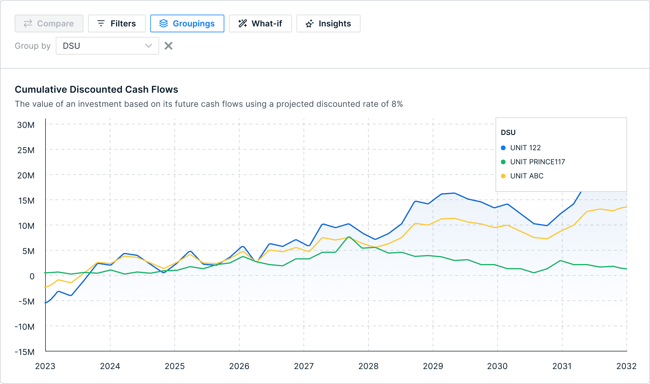
To address this challenge, we adopted an approach that aimed to bridge the existing mental models of a centralized dashboard while introducing a new conceptual model that focused on one key performance metric at a time. We took a top-down approach, providing users with a selection of essential performance metrics. Users were then able to choose any metric of interest and navigate into a dedicated space for in-depth analysis.
By offering this structured approach, we aimed to strike a balance between familiarizing users with a centralized dashboard concept and enabling them to delve into specific metrics for comprehensive analysis. This approach aimed to enhance user experience and ensure that the value derived from the product was maximized.


Scope and Constraints
Customize and Standardize
Data Model and Infrastructure
Reporting Engine
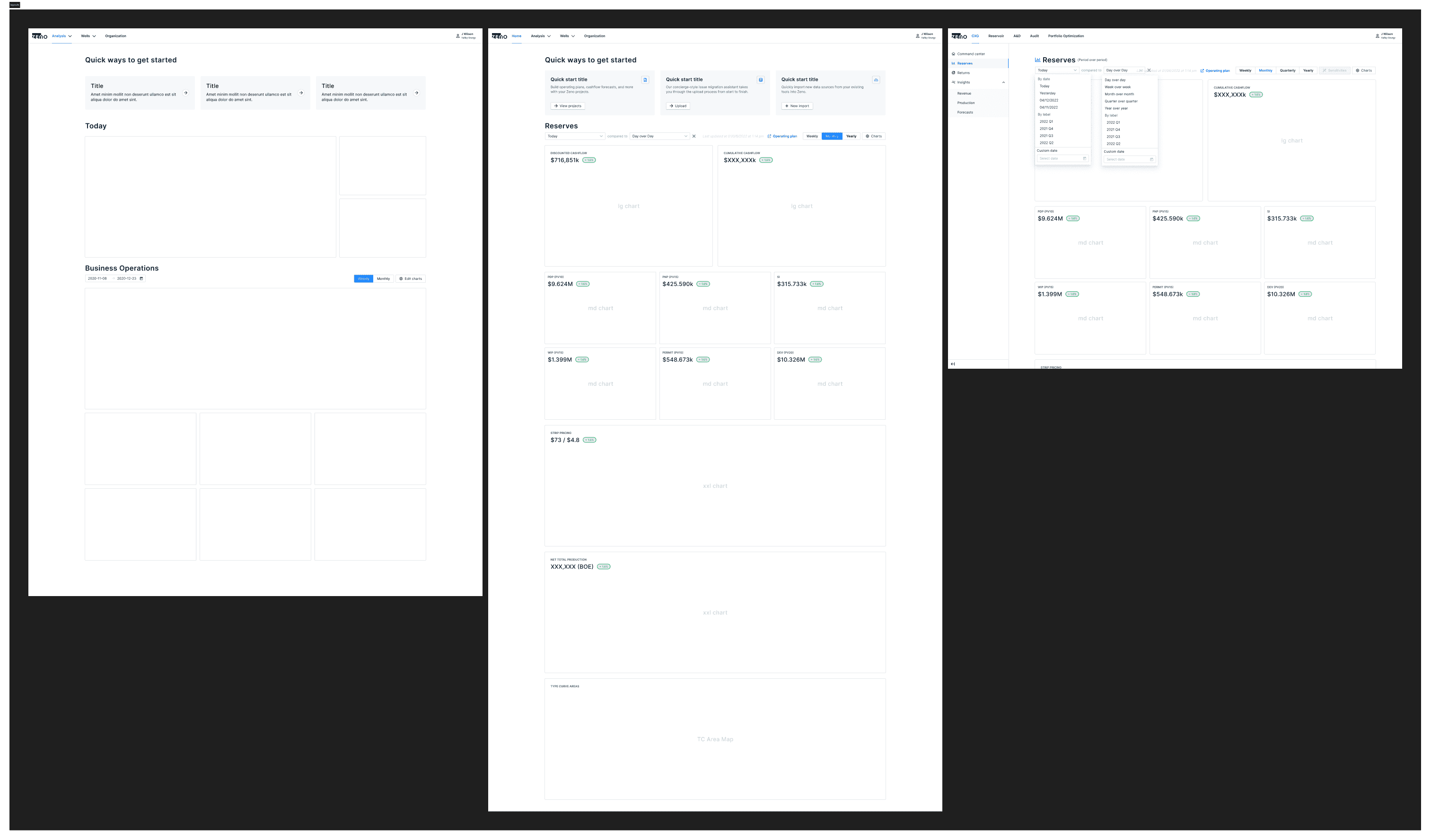
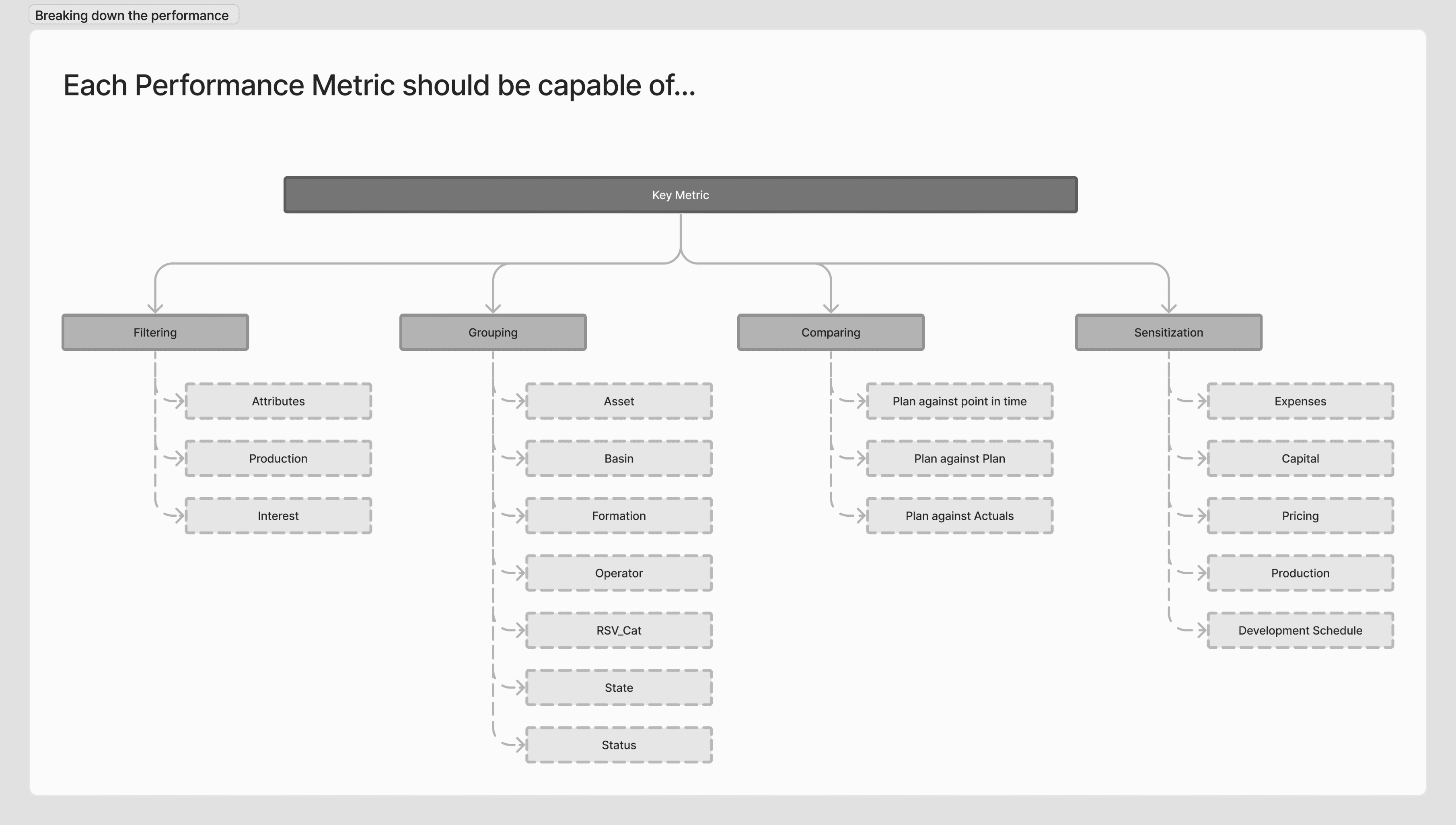
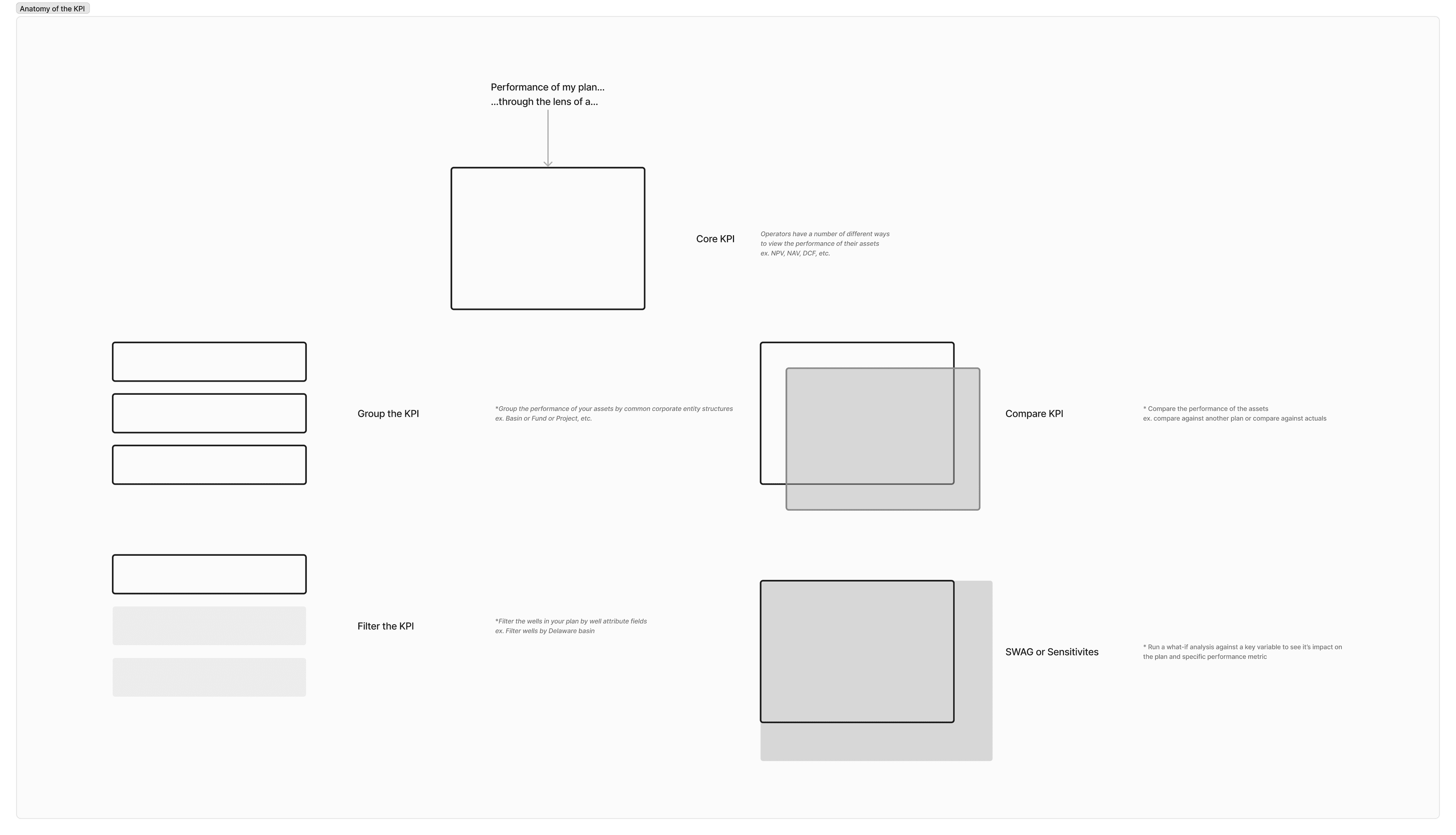
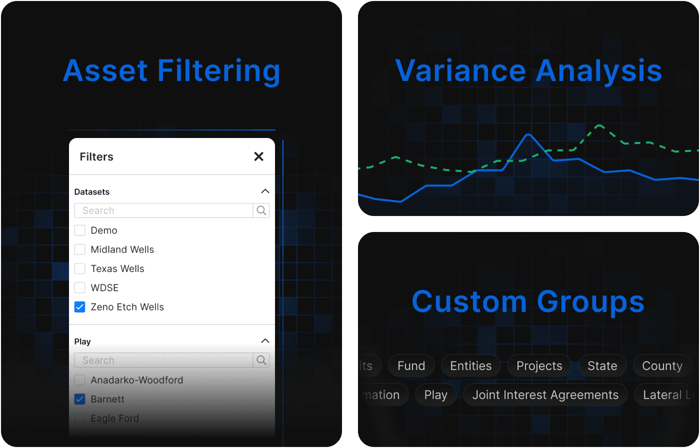
Our objective was to achieve a delicate balance between providing a customizable interface for manipulating large data sets and establishing a standardized approach to performance analysis. After careful exploration, we discovered a solution that involved incorporating a dashboard of metrics while defining certain limitations on manipulation and customization. This approach offered users the ability to explore individual metrics in-depth and conduct further analysis, such as filtering, grouping, and comparing data sets.
By implementing this solution, we aimed to provide users with the flexibility to interact with the data and derive meaningful insights while maintaining a structured framework for performance analysis. The focus on one metric at a time allowed users to delve into the specifics and uncover relevant patterns and trends. This approach struck a harmonious balance between empowering users with data manipulation capabilities and ensuring that performance analysis was conducted within a standardized and coherent framework.
Alongside the considerations for customization, we dedicated time to extensive research and deliberation on the appropriate tech stack that would bring our solutions to life. After thorough evaluation, we identified Plotly's React graphing library as the ideal infrastructure to support our requirements. This choice allowed us to iterate rapidly through different experiences, ensuring scalability as the demand for customized interfaces and advanced analytics increased among our user base.
To further refine our tech stack, we engaged in discussions with our lead engineers. Their valuable input helped shape our approach to integrating Dash into our technology stack. Dash is a framework that utilizes Plotly as its foundation, empowering users to develop dynamic web applications for data visualization. By leveraging Python, Dash facilitates the construction of interactive dashboards, data exploration tools, and various other web-based applications. With Dash, users can effortlessly create user interfaces that are immersive and responsive, adapting in real-time to user input and data modifications.
Through these careful research and deliberate decisions, we laid the groundwork for a tech stack that could accommodate the evolving needs of our users while facilitating the delivery of valuable financial insights in a user-friendly and efficient manner.
Outcomes and Results
Throughout the course of building this product experience, we discovered several outcomes and lessons from the project. The key takeaways and results included:
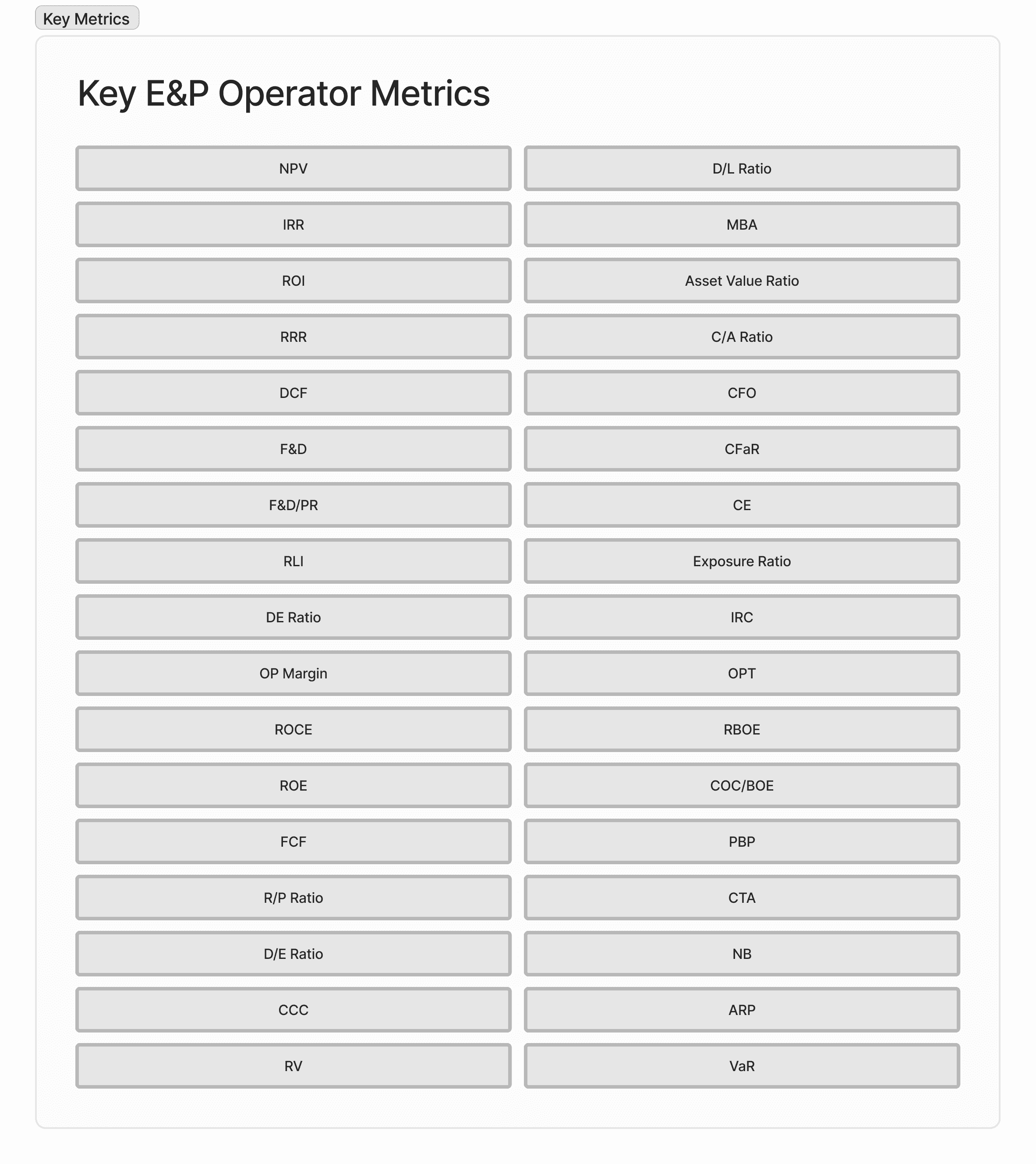
1. Product Discovery and Usability Tests: During the product discovery phase and usability tests, it was discovered that many operators lacked standardized metrics to evaluate asset performance. This insight presented an opportunity for the product, Zeno, to establish itself as the standard in the industry.
2. Aggregating Data Records: The biggest challenge encountered was the aggregation of data records from various sources and systems. Overcoming this barrier was crucial to providing a seamless and comprehensive user experience.
3. Customizable Reporting: The ability to generate customizable reports emerged as a critical requirement. Users sought the flexibility to tailor reports according to their specific needs, enhancing the value and relevance of the provided insights.

4. Scenario Modeling and Decision-Making: Empowering users to perform scenario modeling without relying on functional specialists significantly reduced time spent on tasks and improved the quality of business decisions. This capability allowed for independent analysis and a more agile decision-making process.
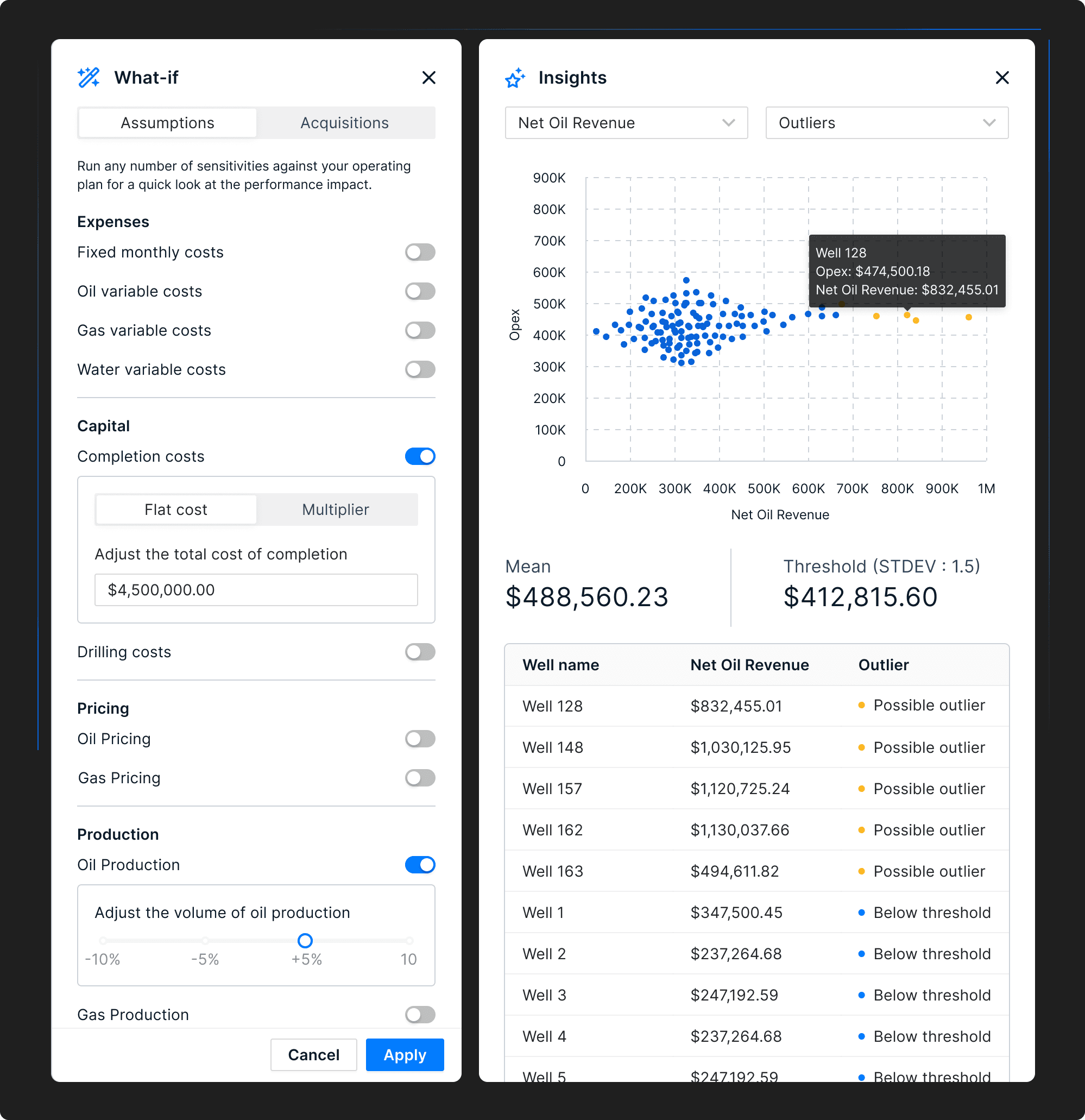
5. Limitations of Dashboards: It was observed that dashboards, while useful for presenting data, often fell short in providing insights into the underlying reasons behind the data. Users required deeper contextual understanding and explanations to fully grasp the implications and make informed decisions.
In hindsight, it became evident that a deeper focus on providing meaningful insights and explanatory context could enhance the product's value proposition further. These lessons learned could inform future iterations, emphasizing the importance of considering user requirements, enhancing data analysis capabilities, and fostering a deeper understanding of users' decision-making needs.